Exploring art and graphic design, diving into how style, trends, and personal identity come together in my visual work.
Minimalism
When I first looked at graphic design trends, Not Quite Minimalism immediately grabbed my attention. I realized I’ve been drawn to this style without even noticing it: clean, simple, but with a playful twist that makes it feel human. I wanted something minimal, yet a little mischievous. By mixing in elements of Functional and Serene, I can create visuals that feel both balanced and engaging.
Bold Minimalism also caught my eye, actually this got the most attention. It gives me the chance to make something modern and striking, while adding playful touches to keep everything connected and visually interesting. I like how these trends let me combine professionalism with personality.
Logo experiments
I started sketching with a plectrum, testing lots of ideas. That’s when I landed on an eagle wing, drawn in a Geometric style. It let me combine multiple subjects in one design, a mix of symbolism and abstraction I really liked.
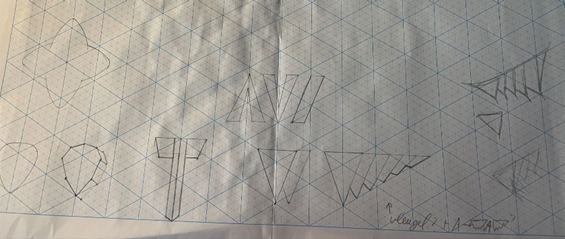
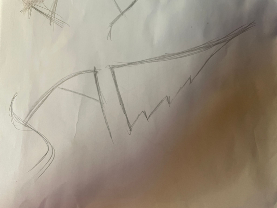
At first, I tried combining the wing with the letter A for my name. I imagined the A with the intensity of a metal band logo, paired with a wing made from distorted geometry and a hint of surrealism. I pictured it on a dark background fading into something else. But in the end, I decided to scrap it and try a completely new approach.
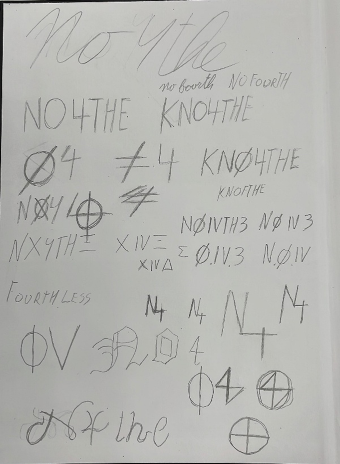
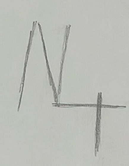
New Logo: No Fourth
During Design 360, I spent a lot of time developing my creative skills and figuring out who I want to be as an artist. Music has always been a huge part of that. Naming my project No Fourth came naturally, it reflects how I often create riffs that aren’t in 4/4 timing or have unusual rhythms. Short, cryptic, and mysterious, it fits perfectly.
Designing the logo led me to symbols that already had meaning, which actually helped me craft something unique. It represents my mindset: I don’t follow the crowd and I like finding my own path, both in music and in my work.
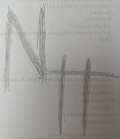
Logo Concepts
Minimalist Symbol: Simple shapes with subtle twists inspired by Not Quite Minimalism and Bold Minimalism.
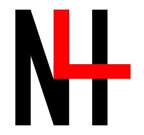
Playful Elements: Letters are combined cleverly—if you look closely, you might spot an ‘H’ hidden in the design.
Trend Integration: Minimalism, boldness, and playfulness blend to create a professional yet personal logo.
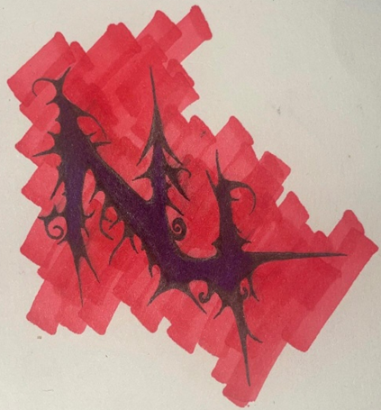
AI version
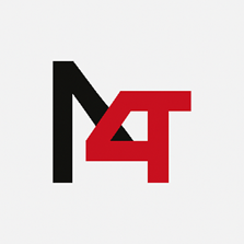
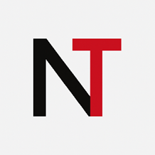
Final Version
The final logo strikes a balance between minimalism, boldness, and personal meaning. It’s flexible enough to work digitally and physically, and it truly reflects my identity as a musician and creative thinker. Even the AI version, though it wasn’t exactly what I wanted, gave me inspiration to refine my ideas further and reach this final design.
Refinements
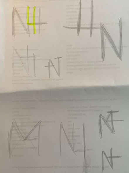
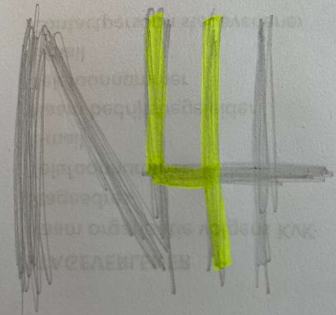
No Fourth